01/The Question

Not everything starts with an idea.

Sometimes it starts with a question.

What if there’s another way?

02 The Possibility

First, a question appears.

It has no answer yet.

But a new possibility is born.

It has no form yet. Form is born when different forces meet in the same question.

03 The Intersection

W — Direction

STRATEGY.

Strategy gives direction. It finds the right question first, then draws the route.

O — Form

DESIGN.

Design gives form. It lends the idea shape, rhythm and weight.

X — Possibility

TECHNOLOGY.

Technology makes it possible. It turns the idea into a system that works, learns and grows.

● — Meaning

EXPERIENCE.

Experience gives meaning. When it all comes together, it is what people remember.

Different disciplines. One way of thinking.

  • Identity & DirectionBrand strategy, identity, art direction.
  • Digital ExperiencesWebsites, platforms, product interfaces.
  • Intelligent SystemsAI-assisted tools and intelligent workflows.
  • Motion & Dimensions3D, motion design and production.

04 The Impact

Thinking finds its answer in the real world.

Ideas leave a trace. Selected work, each a concrete answer to a question: an identity, a package, an interface, a system.
Cover of the Mono Life catalogue: the MONO life logo on a dark background
01 / 13 · Residential / Real estateLogo · Catalogue
  • #181920
  • #796e6c

Mono LifeBuca, İzmir

01 Question
How does a home for one chapter of life make someone say ‘this is mine’?
02 Idea
A handwritten “life” set against MONO’s geometric letters: structure and living meet in one mark.
03 Execution
Logo and catalogue for a one-bedroom residential project in Buca, designed for university students and young professionals.
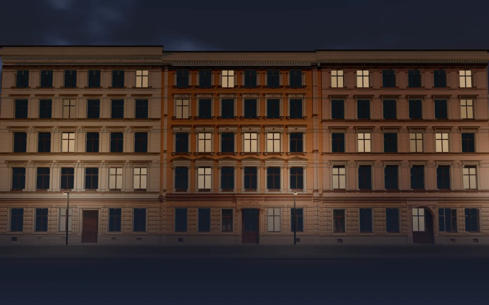
Luckauer Straße 12–14 at dusk: the facade of three Gründerzeit houses, light in only a few windows
02 / 13 · Real estate / ResidentialDigital experience · 3D · Interaction design · Software
  • #1b202d
  • #493021
  • #624430
  • #81654d

Luckauer HöfeBerlin-Kreuzberg

01 Question
How do you tell a house without turning the city into scenery?
02 Idea
The story opens with the facade's own lines; light only in the windows being told.
03 Execution
luckauer.com: a scroll-driven 3D facade, a neighbourhood map built from open data and example floor plans for a residential project of three houses in Kreuzberg.
The Kızılçullu logo embroidered on navy fabric
03 / 13 · Technical servicesLogo · Corporate identity · Signage · Vehicle livery
  • #0e1c33
  • #304060
  • #465774
  • #8294ab

KızılçulluTechnical Services

01 Question
How does a technical service communicate trust at first sight?
02 Idea
A circular emblem and a geometric logotype: orderly, measured and easy to remember.
03 Execution
The Kızılçullu logo and corporate identity on fabric, building signage and letterhead.
The chrome and red Next 26 Kreuzberg logo on a dark background
04 / 13 · Digital experienceUser research · UX/UI · Website · User testing
  • #4f4e4e
  • #262626
  • #b1a3a7

Next 26Kreuzberg

01 Question
Can a name be both a place and a direction?
02 Idea
The X in “Next” turns into an arrow pointing to the next step.
03 Execution
A logo of chrome letters, red numerals and a handwritten Kreuzberg signature.
The 40 Saints Luxury Living logo carved into a stone surface
05 / 13 · Real estate / Villa projectLogo · Identity · Catalogue
  • #938c73
  • #767059
  • #b5af97
  • #565141

40 SaintsLuxury Living

01 Question
What makes the first impression of a place to live that has not been built yet?
02 Idea
A mark that speaks the language of the architecture’s material: simple enough to be carved in stone.
03 Execution
The 40 Saints Luxury Living logo, shown carved in stone; a sales catalogue with villa types, floor plans and location pages.
The Ulusal Network logo in three dimensions, brushed metal letters and purple signal rings on a dark navy ground
06 / 13 · Network / CommunicationsProject design · Corporate identity · Logo · Advertising campaigns
  • #343647
  • #111120
  • #9292a7
  • #5b5c6e

Ulusal NetworkCorporate identity

01 Question
Can the idea of connection fit inside a single letter?
02 Idea
The S at the centre of the word becomes the source of signal rings spreading outwards.
03 Execution
A three-dimensional logo in brushed metal letters with purple signal rings, on a dark ground.
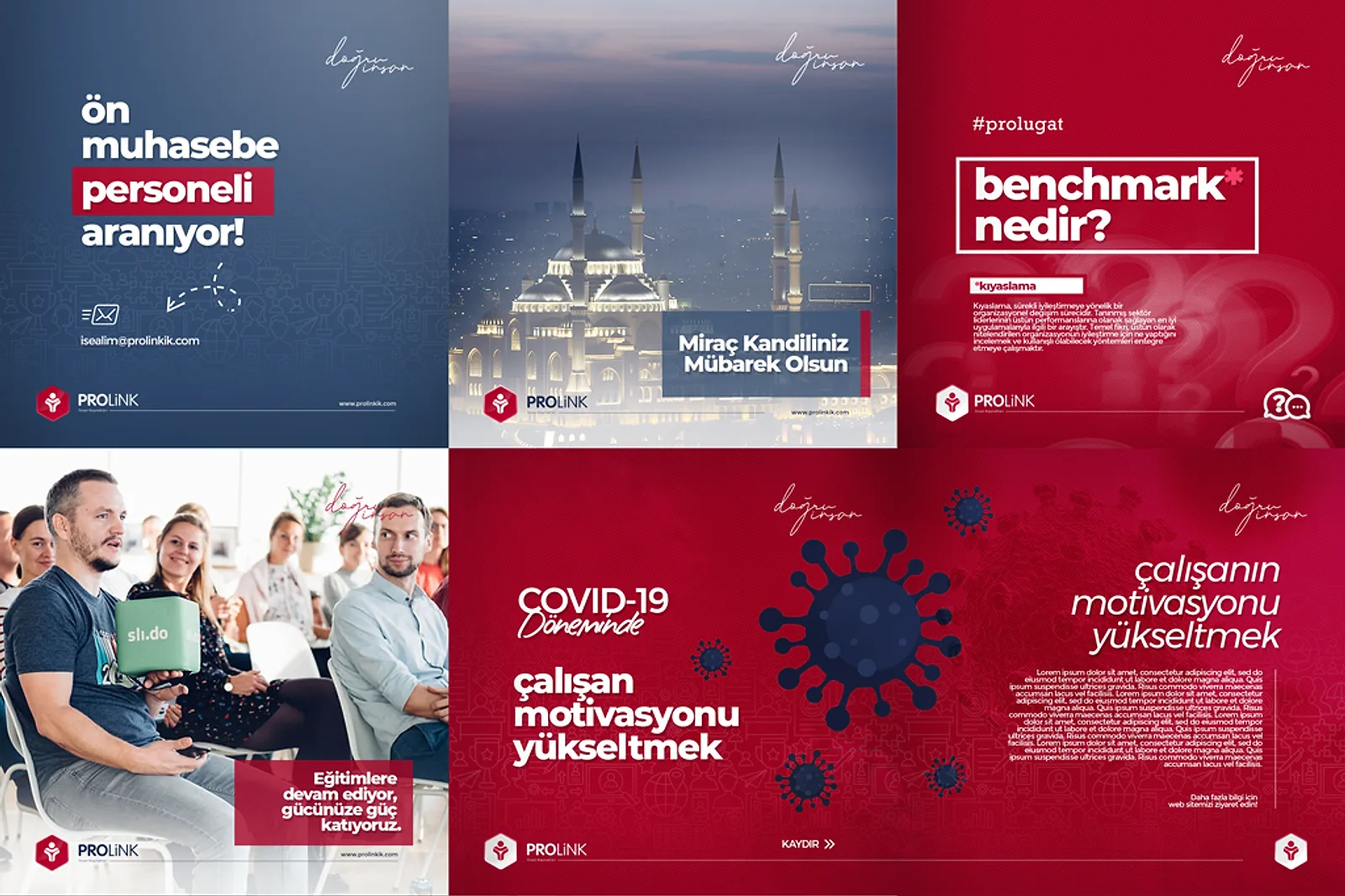
Six posts from the Prolink Instagram feed on red and navy: a job ad, a holiday greeting, ‘what is benchmark?’ and a training post
07 / 13 · Human resourcesSocial media
  • #940825
  • #52617c
  • #a89ba2
  • #b54f63
  • #dedcdb

ProlinkHuman resources

01 Question
How does a human resources firm look like ‘the right person’ in a feed?
02 Idea
In the corner of every post, ‘doğru insan’ in handwriting: a personal signature inside a corporate language.
03 Execution
An 18-post Instagram feed on red and navy grounds: job ads, holiday greetings, explainers and service posts, each signed by hand with ‘doğru insan’ (the right person).
The white embossed OKON Holding logo on a blue texture
08 / 13 · HoldingLogo
  • #553edf
  • #3321c4
  • #26262b
  • #b3b1c4
  • #e6e5ef

OKONHolding

01 Question
How do you hold several companies together in a single name?
02 Idea
The letters break into pieces, yet legibility is never lost. The pieces make the whole.
03 Execution
The OKON Holding logotype, built from cut forms.
Open the case
Open the case: OKON
The gold Canto Orchestra logo and star form on black
09 / 13 · Music / StageLogo · Website · Corporate identity
  • #1d1d1d
  • #3c3326
  • #6a5639
  • #ac9361

CantoOrchestra

01 Question
How do you carry an orchestra’s energy into a still mark?
02 Idea
The flow of handwriting strikes the edge of a star. Movement and stage meet in one line.
03 Execution
The handwritten Canto Orchestra logo, interlaced with a star form.
The Feyruz Jewelery logo embossed in copper on a dark teal card, with a letter pattern behind it
10 / 13 · JewelleryLogo · Identity
  • #070c0c
  • #1b2c2c
  • #2e4947

FeyruzJewelery

01 Question
How does a jewellery brand convey value before the product is even seen?
02 Idea
The letters turn around a centre and become a single seal: both monogram and ornament.
03 Execution
The Feyruz Jewelery logo embossed in copper on dark green, with a surface pattern derived from its letters.
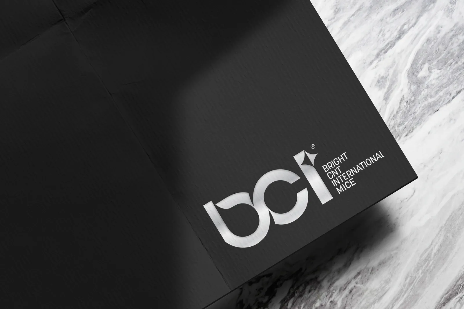
The BCI Bright CNT International MICE logo printed in silver on textured black paper, beside a marble surface
11 / 13 · Events / Congresses (MICE)Logo · Identity
  • #333333
  • #191919
  • #cececf
  • #757575

BCIInternational MICE

01 Question
In international events and congresses, how does a name earn trust at first contact?
02 Idea
Lowercase letters connect through soft curves; the tip of the i becomes a line of light.
03 Execution
The BCI logo printed in silver on black paper, with the four-line name Bright CNT International MICE.
Open the case
Open the case: BCI
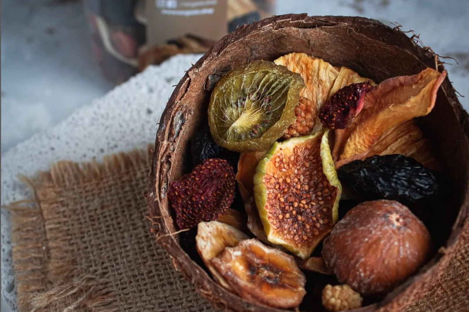
Dried figs, kiwi and fruit in a coconut-shell bowl on burlap
12 / 13 · Organic foodStrategy · Brand · Web
  • #563b2f
  • #2d1813
  • #865738
  • #bd8555
  • #adb5bc

N’OrganikOrganic food

01 Question
How little does it take to tell what is natural?
02 Idea
Kraft paper, linen and wood: the product speaks through its own textures.
03 Execution
Products in kraft paper packs, product photography on dark grounds and an online shop greeting visitors with ‘Hoşgeldin 2021’.
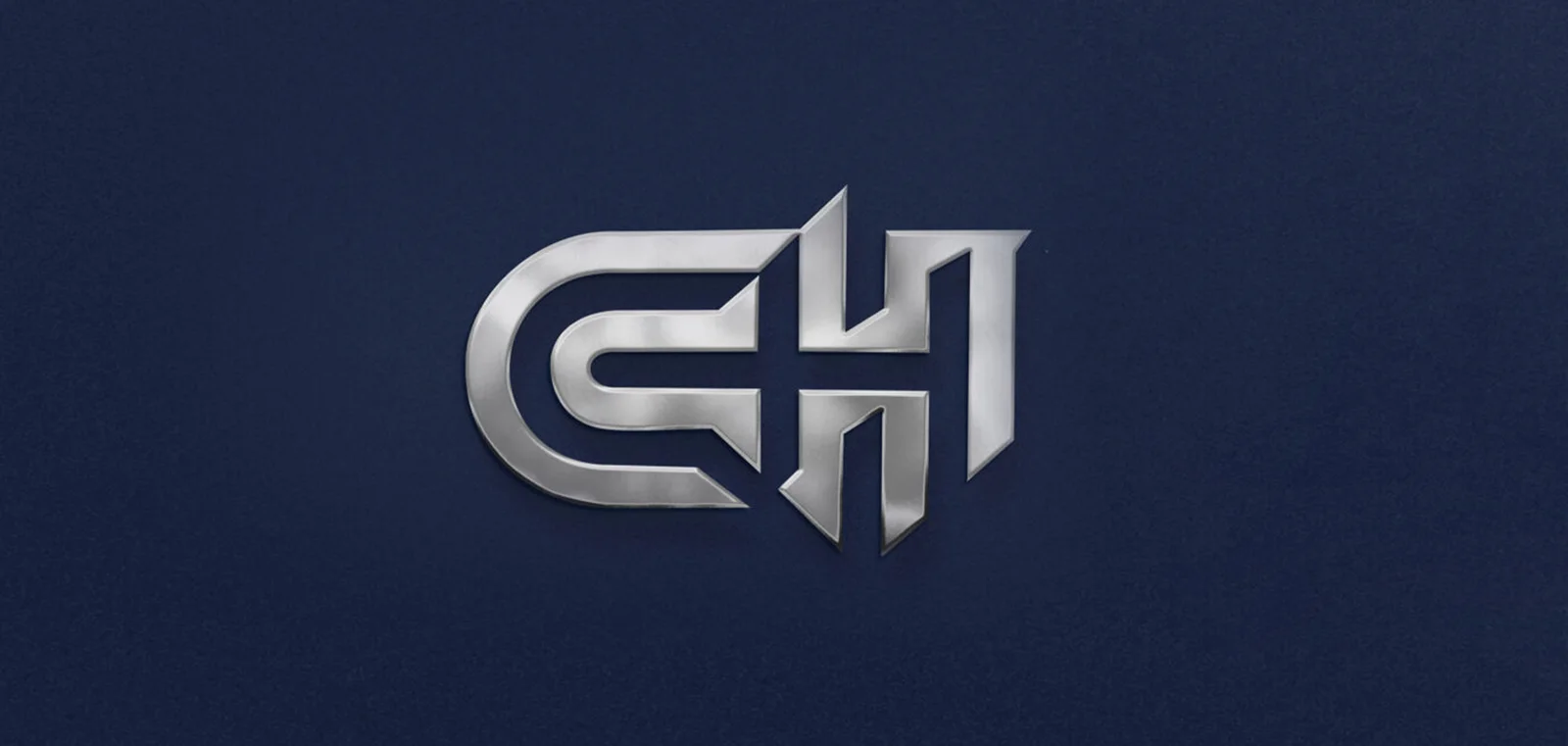
A polished metal CH monogram embossed on a textured navy ground
13 / 13 · Concrete / ConstructionLogo
  • #1f2843
  • #7c7e84
  • #b7b7ba
  • #44495a

CHBetonLogo

01 Question
How does a material as hard as concrete carry both strength and finesse in one mark?
02 Idea
The C embraces the H; the H's sharp ends stand like an edge fresh from the mould.
03 Execution
A sharp-ended monogram in which the C and H interlock, shown as an embossed metal mark on a navy ground.

From the archive

  • ArtmacFood / Snacks · Packaging, Social media
  • Munchies Coffee & LoungeBranding, Identity, Social Media
  • SGT TokenToken project · Identity
  • Meriç NakliyatBranding · Logo
  • Doğal 1Marketplace · Logo, e-commerce, social media
  • İste KaliteAuditing · Logo
  • TemassDigital business card
  • DismekChemical technology · Catalogue
  • BucaLogo

What we believe

Design is more than what shows.

Technology is more than what works.

Strategy is more than what’s planned.

Theyaredifferentlanguagesofthesamethought.

05 — The BeliefWe explore the limits of thinking, not of disciplines.

06 The Studio

We answer to no one but the question.

WOX is an independent creative × technology studio founded in İzmir. We treat strategy, design, technology and motion not as separate departments but as one way of thinking.

Independence, for us, is not a size but a stance: starting every project by asking the right question, and following the answer all the way, whatever the discipline.

Idea Workshop

  1. 01

    Question

    We look for the question behind the brief, not the brief.

  2. 02

    Workshop

    Strategy, design and technology think at the same table.

  3. 03

    Prototype

    We make the idea tangible early: visible and testable.

  4. 04

    System

    We deliver not a single output but a language that can grow.
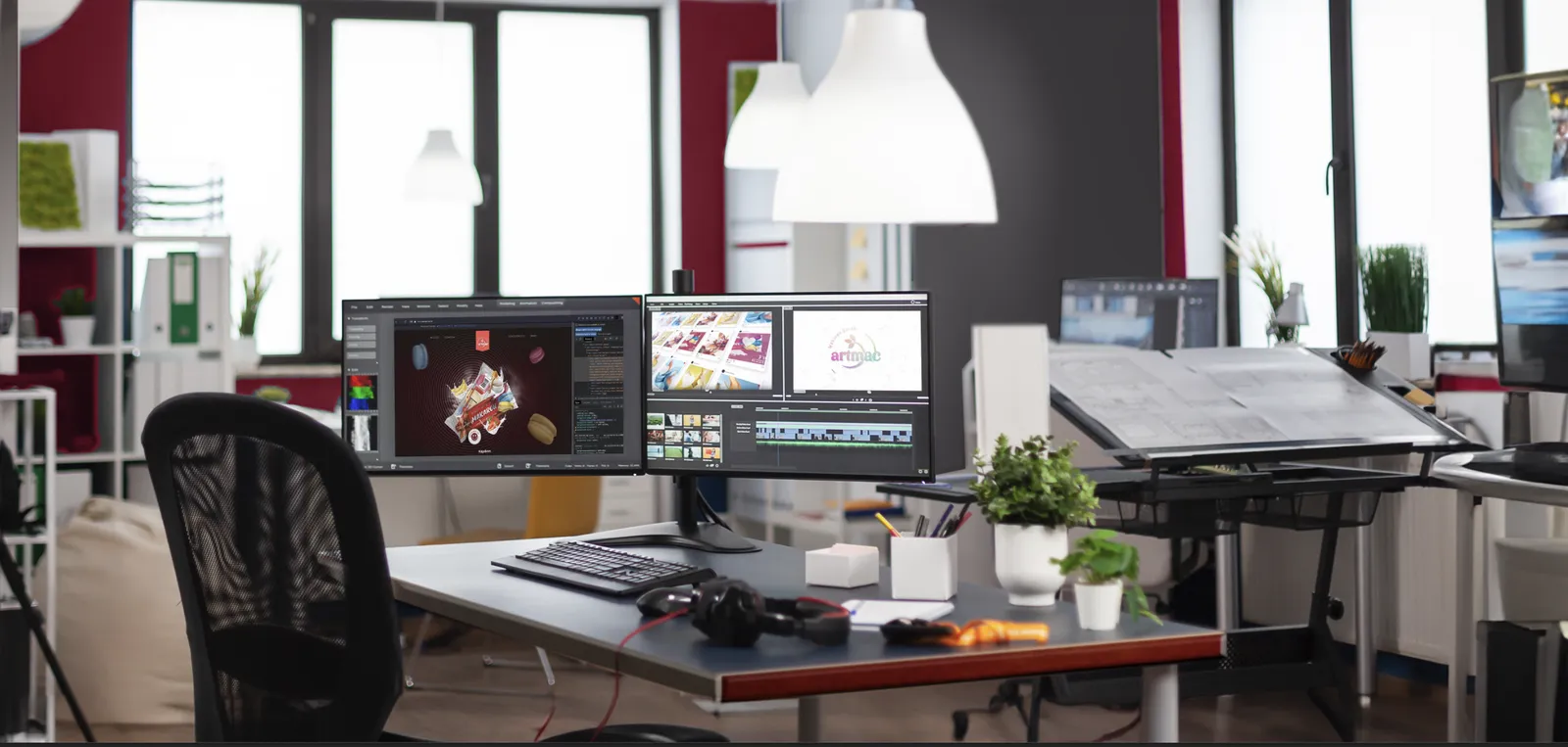
A drafting table and a two-screen desk; on the screens, identity and motion design for Artmac Makaron
Happy clients
260+
Return for new solutions
85%
Global and local brands
70+

İzmir38.42° N — 27.14° E

İZMİR

SOMETHINGGOOD STARTSHERE.

What if there’s another way?

There is. Let’s find it together.

What if?

A project, a question or just curiosity. Everything starts somewhere.

hello@wox.digital

Start a project

Your project, briefly
Field
Timing
Scale